Nordstrom Rack
〰️
Homepage Redesign
Nordstrom Rack 〰️ Homepage Redesign
Nordstrom Rack:
Homepage Redesign
The year was 2020 and it was time for a Nordstrom Rack homepage upgrade. We knew customers came to the rack for the thrill of the hunt… But we were not giving them a clear place to start their shopping journey. Our technical limitations and outdated CMS degraded the customer experience and I had the opportunity to make it better than I found it.
Platforms: App, Mobile Web, Desktop Web
My Responsibilities
Designed for iOS, android, Mobile Web, Tablet Web and Desktop Web
Determined use cases with product managers
Conducted competitive research
Designed wireframes and high-fidelity mockups
Usability testing to determine feedback/iterations
Worked with IT/ Stakeholders to review and implement functionalities
Business Objectives:
Sessions: daily, weekly, monthly, etc.
New vs. Repeat visitors
Bounce rate and time spent on page
Conversion rate for those who visit HP in their session.
Content interaction (compared to search, nav, bounce)
Revisit rate for HP visitors vs. rest of visitors
CMS Success Metrics:
Demand via incremental content (especially MOW)
Content interaction (expecting an increase in avg clicks/tile)
Impact on revisit rate
Merchandising & Marketing CSAT (as users of the CMS)
Customer feedback (on new layouts, features, usability)
What we knew
Brainstorming Session
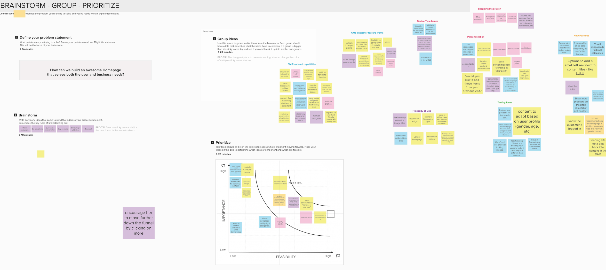
To really get to the root of our business issues, I conducted a brainstorming session with all the top business org partners ie: Marketing, Merch, photo studio, copy, engineering, etc, to help understand all wants and pain points from their organizational standpoint.
Top Voted Pain points: #1 Pain point- Multiple CTAs per promo, Personalization/Recommendations, More Tiles / Space for content, Tagging abilities
Grouped Themed Pain Points: CMS backend capabilities, CMS customer feature wants, Device Type constraints, Grid Flexibility, Shopping inspiration, Personalization
Competitive Research
Once I understood what our business what in need of, I turned to our users to be sure we were solving for the right problems.
60 User tests comparing Nordstrom Rack to various retailers on 2 platforms
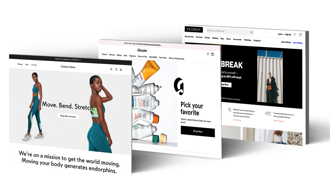
Main findings and recommendations:
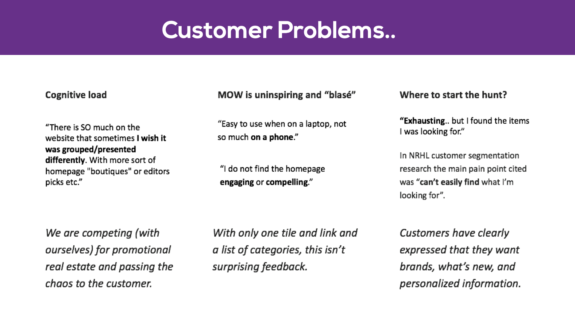
More categories on the homepage, and if you’re going to show products- don’t let them be random. Folks want seasonal, on trend, deals, and personalized categories.
Deals Deals Deals, make it obvious and let them know how to find it.
Play with different category displays on Mobile, no need for two text lists of categories ( homepage and hamburger menu). This homepage space is not being utilized well.
Display more than one promotion on MOW, users want to be inspired by product images upfront.
Don’t make the homepages too long- sometimes less is more. What we create for WEB doesn’t necessarily have to translate 1:1 for MOW.
What we’re we trying to learn?
What stores to do you go to, to find the best fashion deals?
Thinking about an ideal homepage experience, what are some of the things you would hope for?
Initial impressions of the website? Rating 1-5
Which homepage did you prefer?
What were some major differences, if any, between the two sites that come to mind?
Were there any features you wish you saw on Rack Homepage?
“Tradesy is interesting, I know I’m going to have good time because I knows that someone took the time to curate this page. It shows that they are inspiring me and it feels worth my time.”
“Rack is an example of a site that drives me crazy! Too much text, and not enough imagery.”
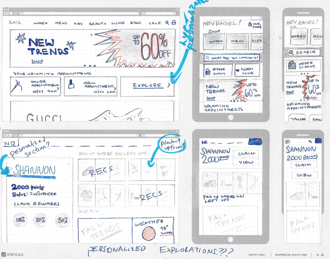
Design Explorations + Iterations
We also know, when customers are exposed to recommendations based on shopping behaviors they are… around 7% more likely to add product to cart. These are some exploratory examples of how personalization could heighten the customer experience.
Homepage Grid
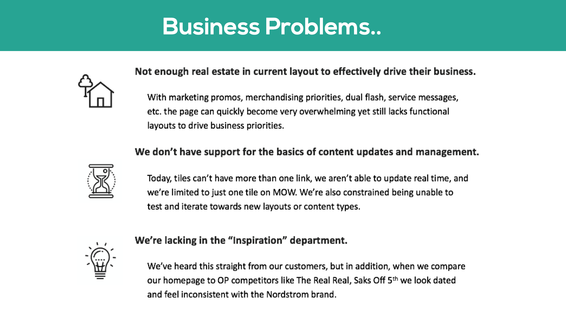
One of the bigger issues, was knowing we were limited to a non-adaptive 960px width grid on an outdated CMS.
When thinking about the new homepage design, we want to create guidelines and suggestions for the various components within the new grid system since we would be updating the platform.
Because of our new 12 column grid we will be able to create many variations of our modules to fit within our new system.
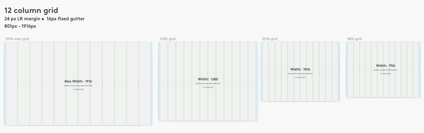
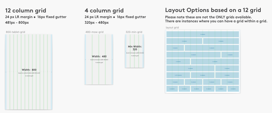
Working with the creative marketing team, I defined component modules and guidelines as a blank canvas for their creative inspiration.
The most noteworthy changes on the page:
7 Tiles (mostly static) to 10-12
Rotating Product Trays – personalization ‘light’
“Service Bar” components
Dedicated value prop banners
Content + Product components
Shop by category tray
Multiple CTAs on any component
Usability Analysis: Old Design vs New
I ran over 70 usertests to understand customer wants and pain-points, took a look at our competitive landscape, and conducted brainstorming sessions with all the top business partners to help understand all wants and pain points from their organizational standpoint. One of the main callouts our customers wanted, was more product, content, inspiration, and guidance of where to start their shopping journey on the homepage.
Driving Questions
What are our customers wanting out of the NRHL homepage?
What types of features would appeal to our customers?
Is what we are proposing in the V1 version of the homepage redesign meeting our customer expectations?
Is what we are proposing in the V1 version of the homepage redesign meeting our business expectations?
Wins
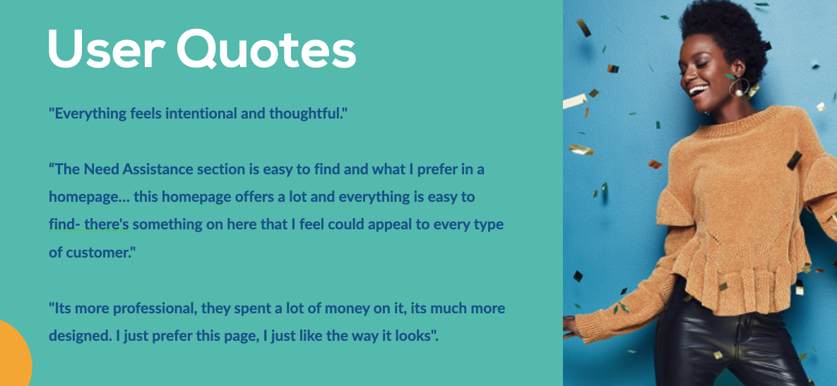
The old site doesn't give suggestions of where to go to look for things where the new site does. Users like being offered various starting points to start their shopping journey.
The new design is more professional, it feels like a finished website, like they brought a designer in a put a lot of thought into it. A lot more pictures, and the pictures really sell the products.
The future site was more appealing, it flowed more easier and made more sense.
New version, bigger imagery, more recent, seems competitive, more modern and captivating and a lot more quality. A lot more to offer.
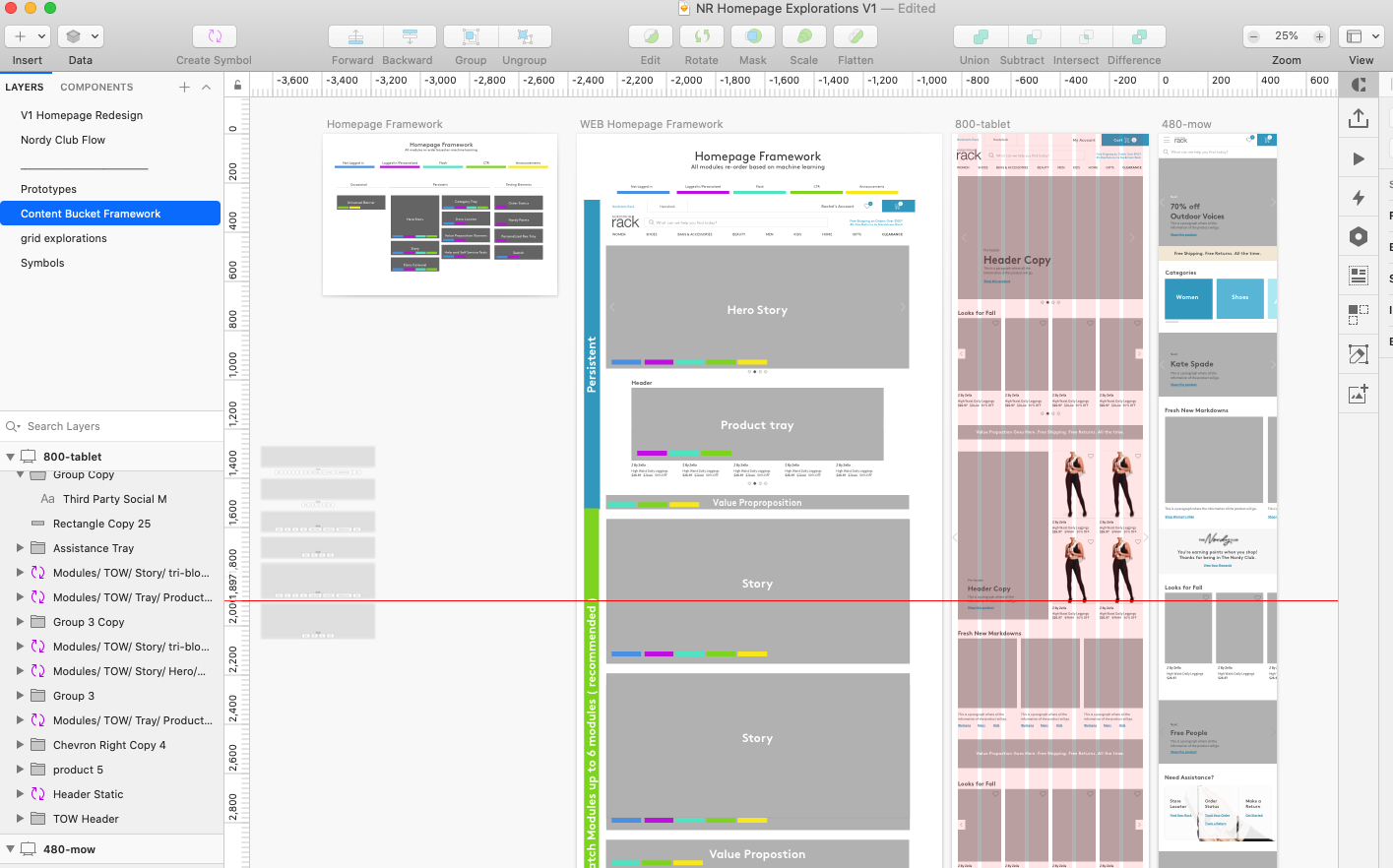
Component Library
Once we determined baseline component modules, I began to document them in an ever living library within our design system. This library will persist and grow as we A/B test, determine edge-cases, and build the foundational elements for the homepage. These will be referenced not only by our UX team, but by our creative and platform teams as well.
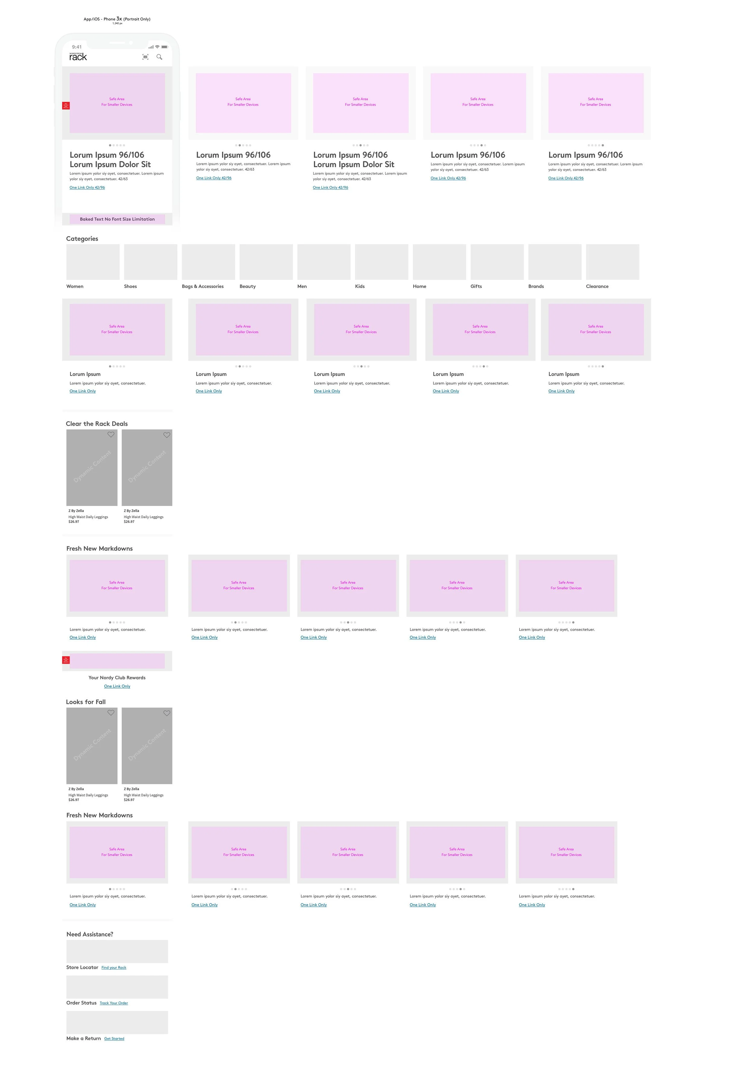
Before: Homepage Experience
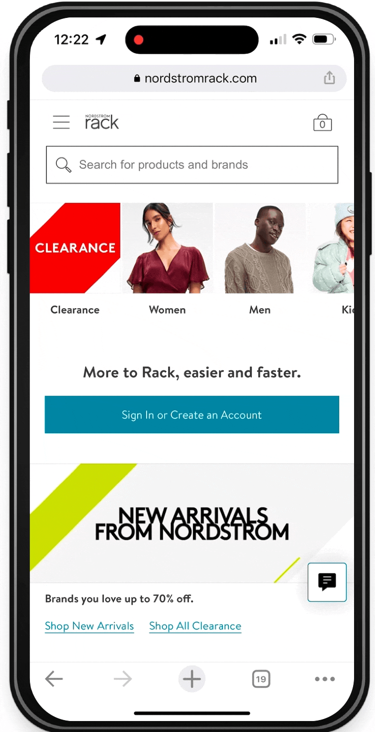
Prior on mobile web, we had a singular story image that left more to be desired, and a list of categories that is repeated when you hit the hamburger menu. Customers have repeatedly stated they want a better use of this homepage space with more imagery, more inspiration, and more products upfront.
With the % of traffic on MOW and customer quality on App, this is where we'll focus resources to ship re-designed pages pre-holiday.
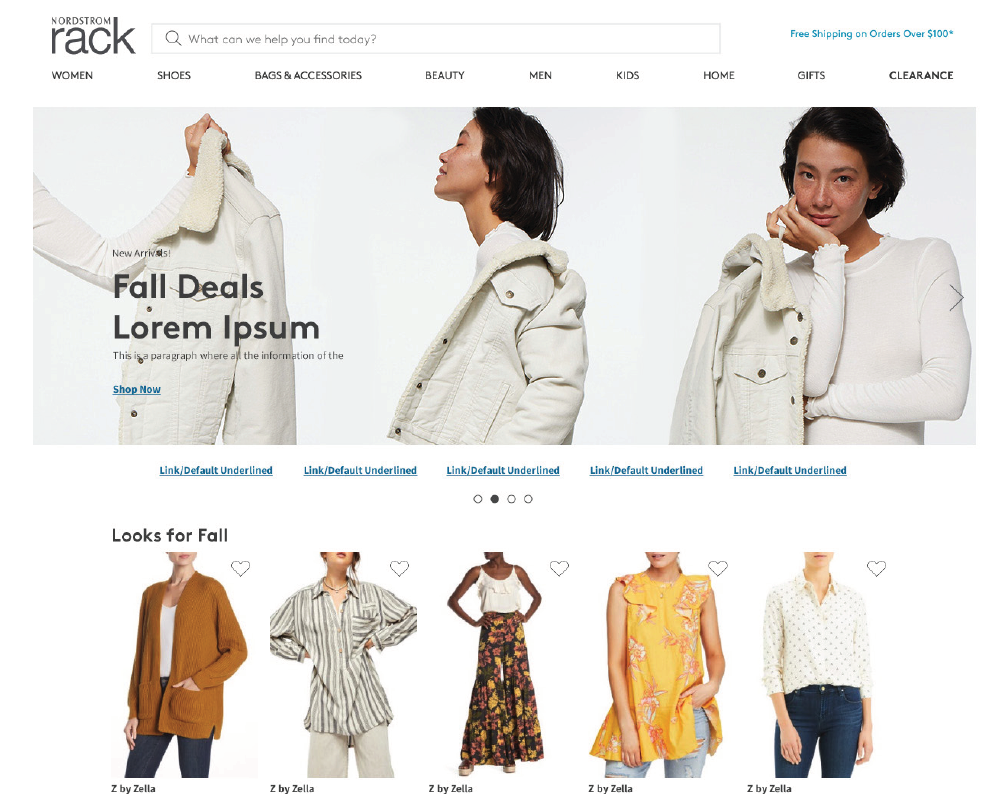
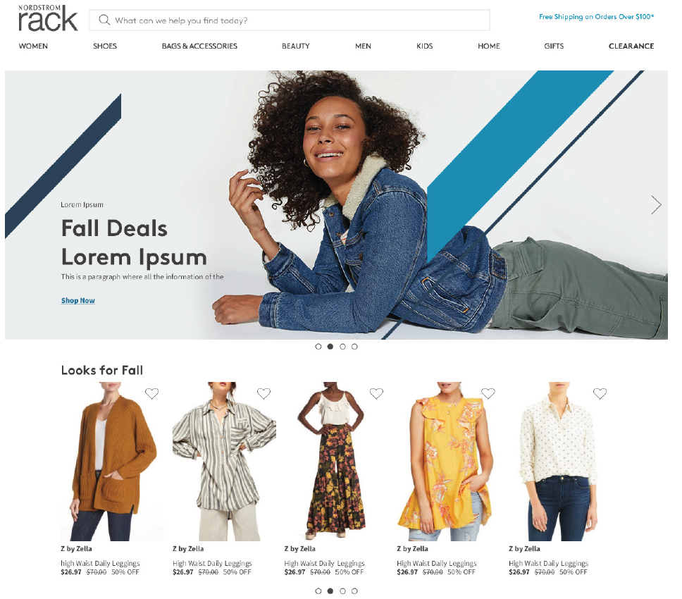
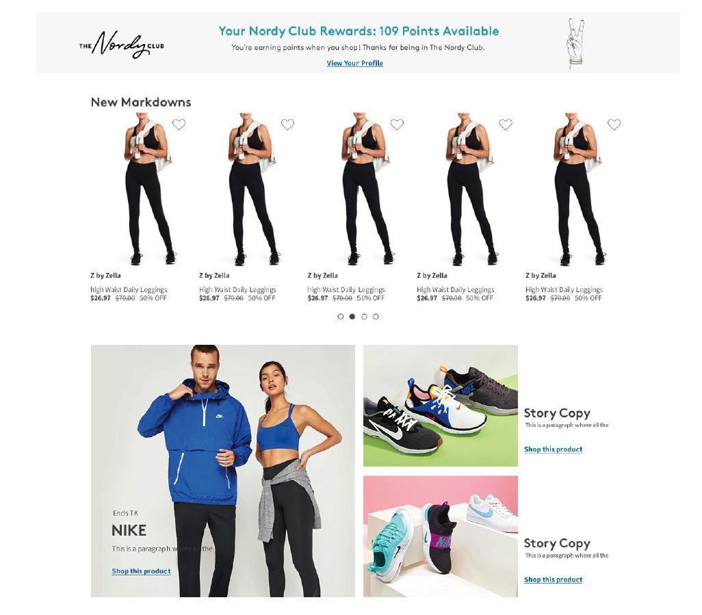
Launched Homepage Experience
For the new upgraded Homepage, we added a rotating hero stories banner to bring inspiration upfront, a quick category navigation with a swiping component display, which is something that has performed well in full price.
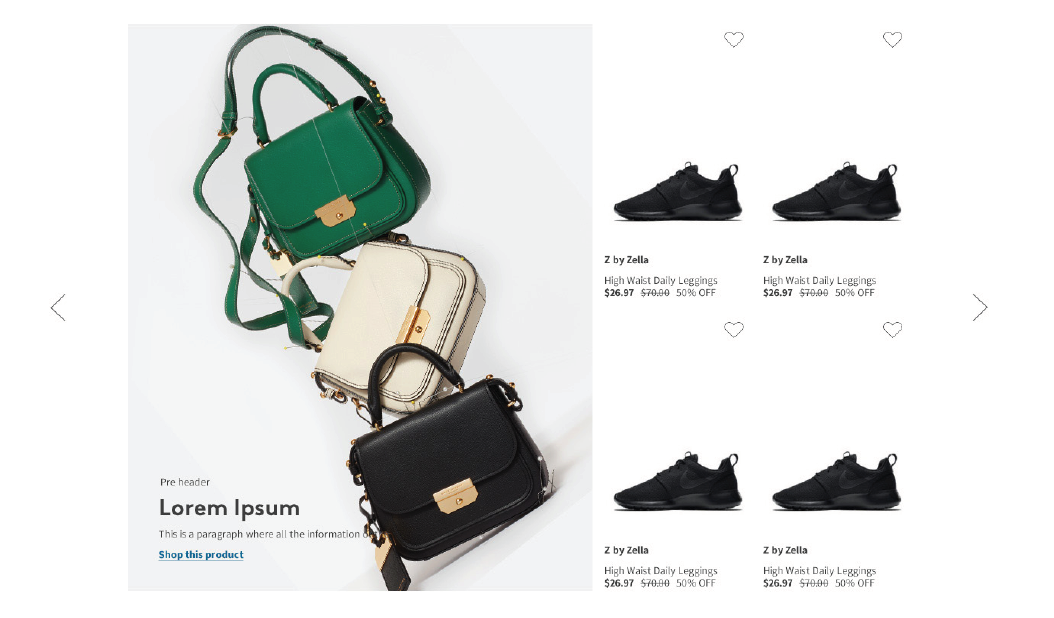
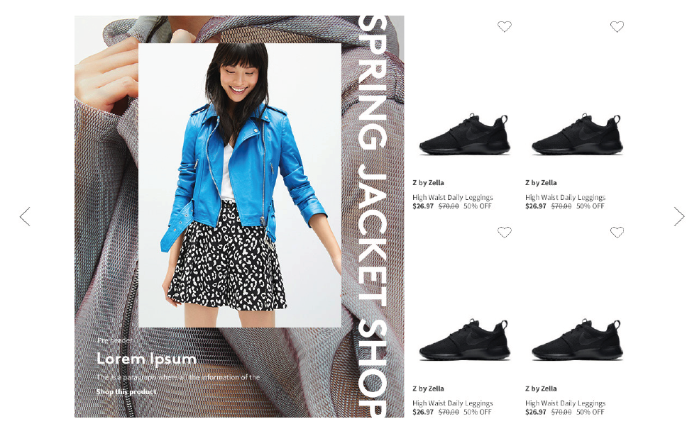
We Added two product trays which can provide curated content based on the Header copy ie: Looks for Fall, or Clear the Rack Deals bringing products on the page further up funnel. And are adding additional stories throughout the homepage giving people inspiration and an easy jumping off point for starting their shopping journey.
We're also introducing light personalization through experiences that already exist like the Nordy Club loyalty banner which can display your points if you're logged in, or encourage you to sign up if you’re not.
Additionally, we met with customer service to address top pain points and quick wins to drive down customer call volume like order status, and returns so they can focus on taking care on bigger customer concerns.
